
Redesigning the Notification System @ Paperless Parts
🚨 How might we improve usability and increase engagement of notifications?
Team
Sole designer. Scott Campbell (engineering), Jake Rigos (PM)
Methods
Current state analysis, best practice research into notification systems and UX, redesign notification toast messages, popovers, and page on Figma.
Timeline
2 months. December 2022 - February 2023.
Role
Design lead. This included: conducting in-depth research into notification system UX & best practices, establishing a robust notification system framework, complete overhaul and enhancement of notification toast messages, popovers, and page, & facilitating efficient communication and seamless handoff with engineering teams.
Process
🔎 Research: current state analysis, best practice research
📢 Define: user needs statement, design and feature requirements
🎨 Ideate: determining design direction in Figma
💻 Design & deliver: Designing micro-interactions, empty states, and detailed Figma file for development handoff
Research: Current state analysis to understand current UI issues
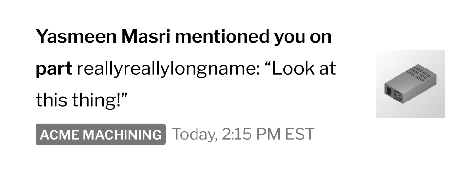
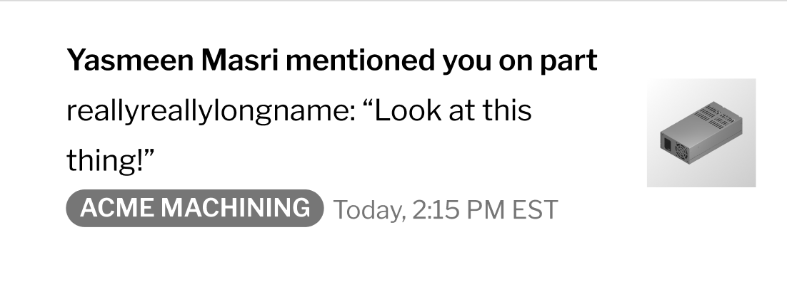
Before: Notifications pageDeliverables
New enhanced designs for toast messages, popovers, page, search results, filtering, and empty states.
Background
Paperless Parts’ notification system was in need of a redesign. It was outdated, had poor UX, had extremely low user engagement rate, and had immense potential for growth.
This project’s enhancements involved design but not functional changes, with a focus on three key aspects: the Notifications toast messages, popover, and page.
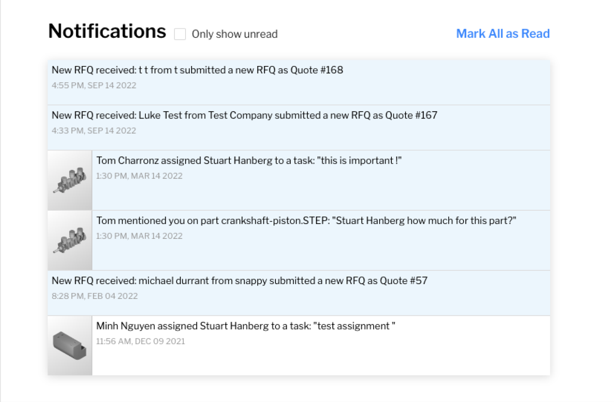
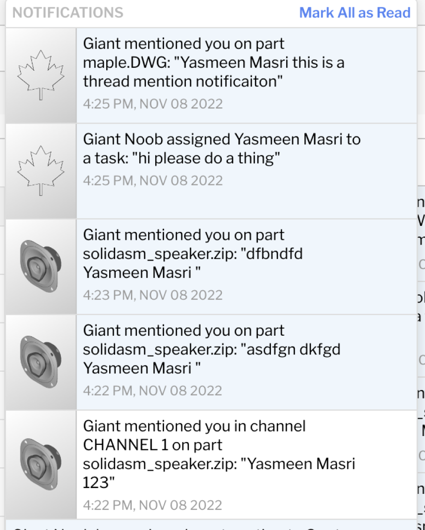
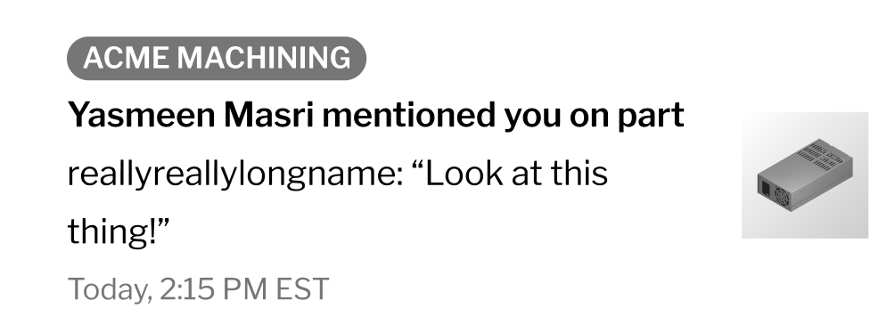
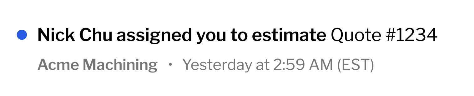
Before: Notifications popoverI conducted an in-depth design review to understand where the current system was lacking and how it could be improved. Below are the four main issues that I found:
-
The current notification system was not scalable across different notification types.
Placing the picture on the left created visual inconsistency with notifications include a picture vs. the ones that don’t.
-
Poor accessibility demonstrated by the use of very light grey on white background, in the timestamp and title.
-
Lack of hierarchy made it hard to scan or read notifications.
-
Notification popover was on infinite scroll, which made it hard to scroll and read notifications with constant loading.
Notification popover lacked a way to link users to the page (ex. view all notifications).
Incorrect use of design system confused users (ex. ‘Only show unread’ was a checkbox)
Hover color was used to indicate an unread notification
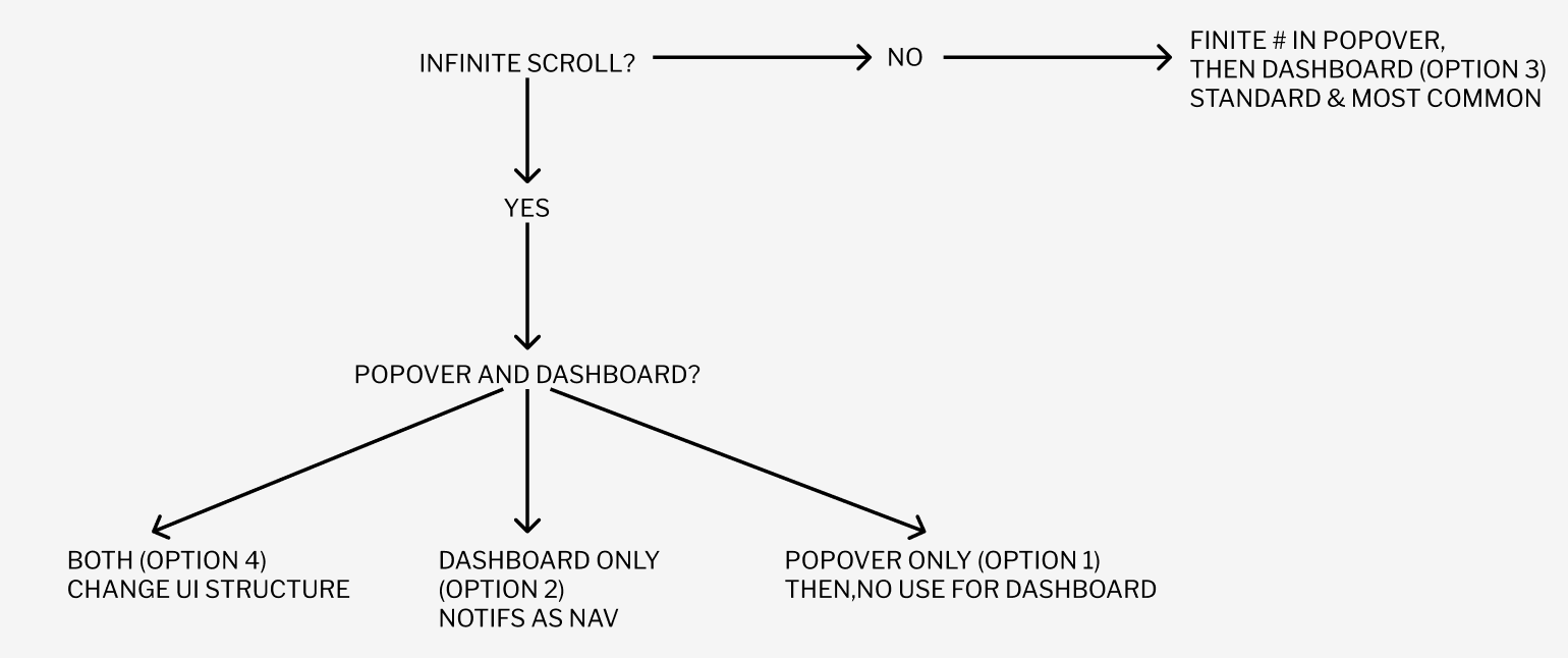
Research: Best practice research to understand common UI patterns
Before designing, I conducted some research on common UI patterns for notification popovers, as we were debating moving away from infinite scroll.
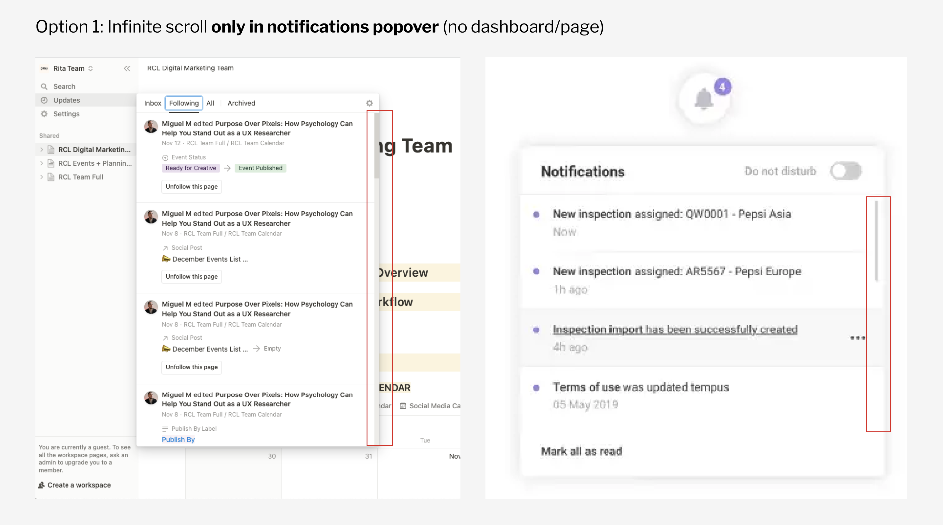
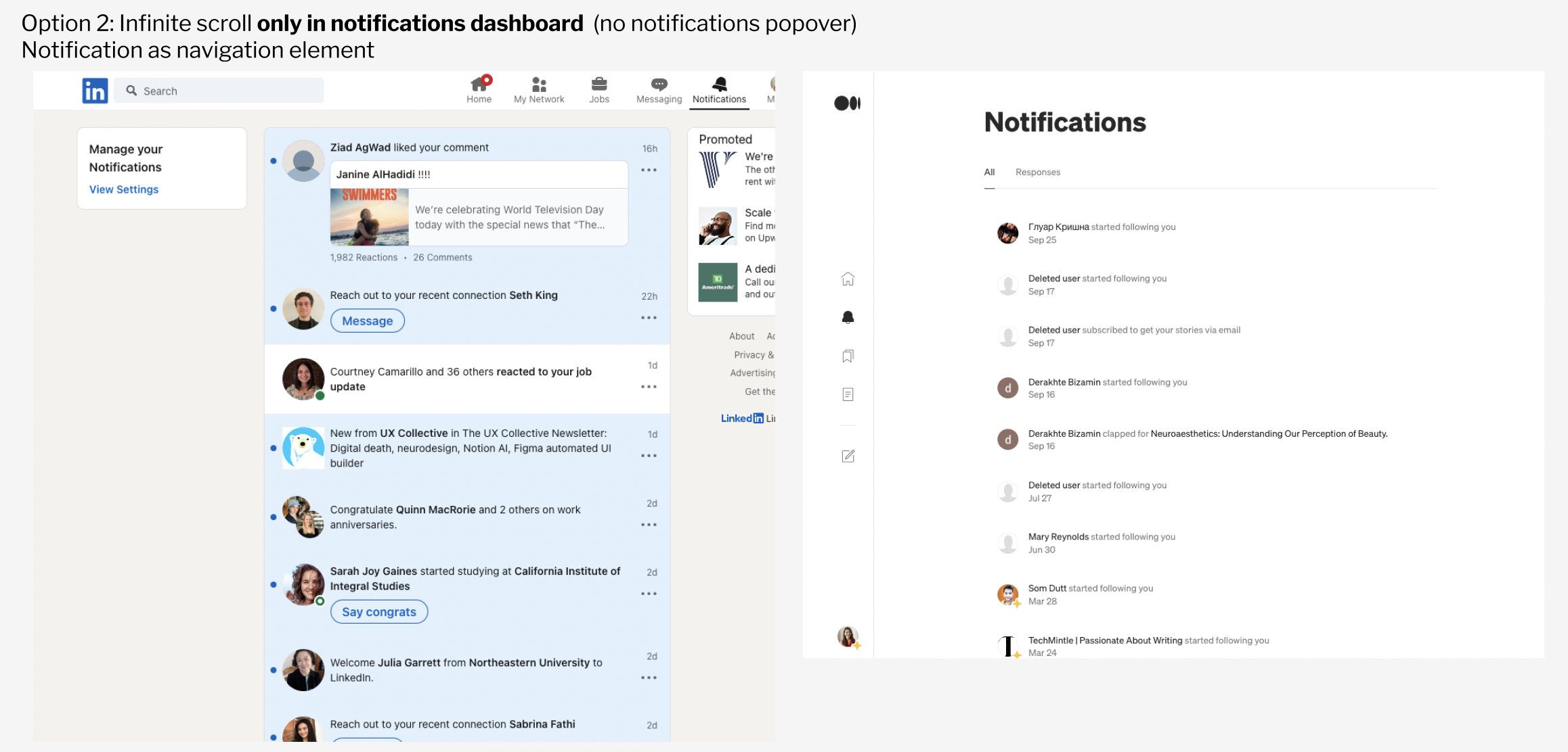
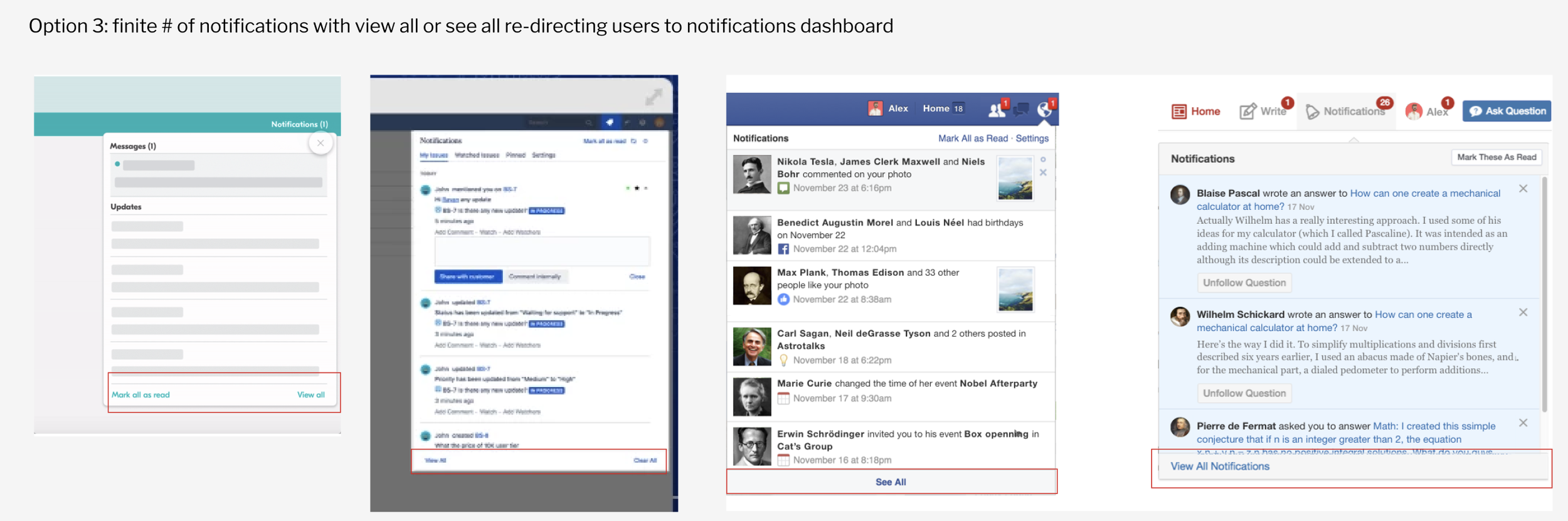
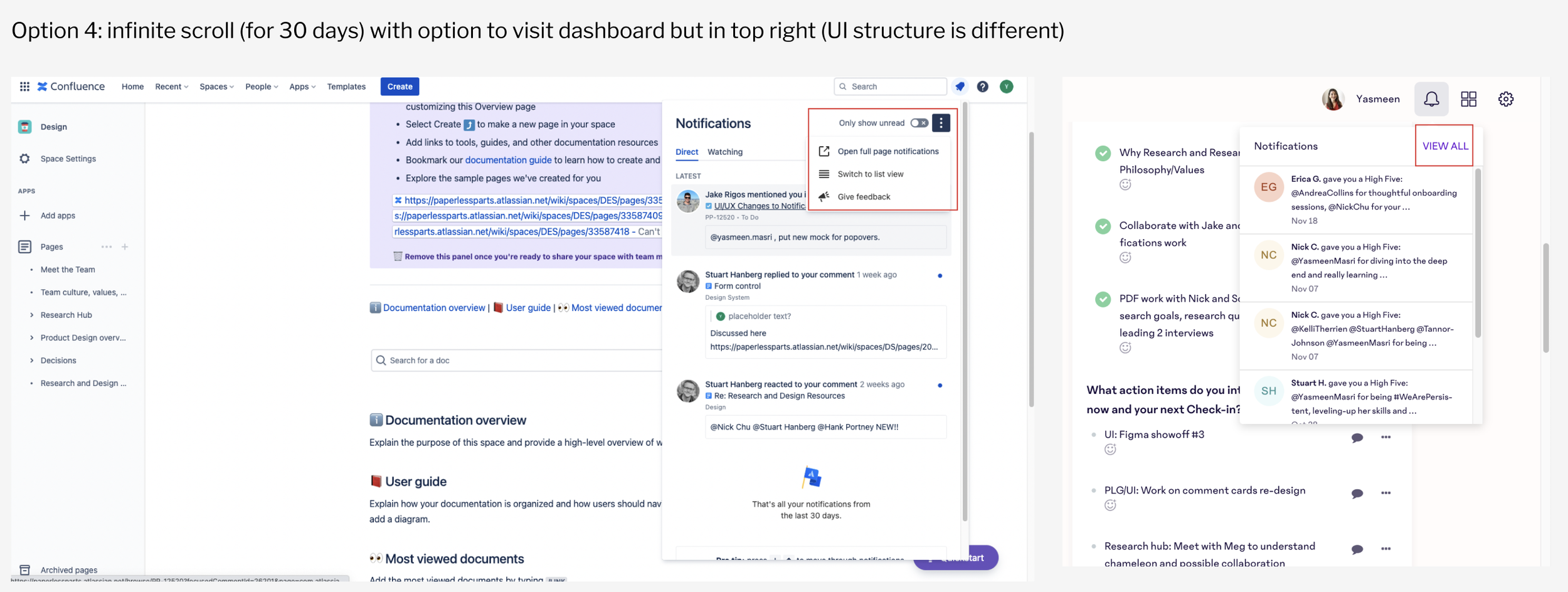
I later presented all these options along with the flowchart, below, to the product manager and engineering lead, convincing them that option #3 would be best.
Define: User need statements + uncovering design & feature requirements
I met with the product manager to hone in on user needs and design requirements. Here’s what we landed on:
Users need a way to quickly recognize if the notification is read or unread
Users need a way to access the Notifications page
Users need a way to ‘Mark all as read’
Users need a way to see the time and date the notification was created
Users need a way to see which organization the notification is from (this is useful for managers who typically oversee several different locations)
Users need a way to see what the ‘active’ organization is (active organization means the one they are logged in on. To view notifications from other locations, they would have to switch accounts)
Ideate: Determining design direction
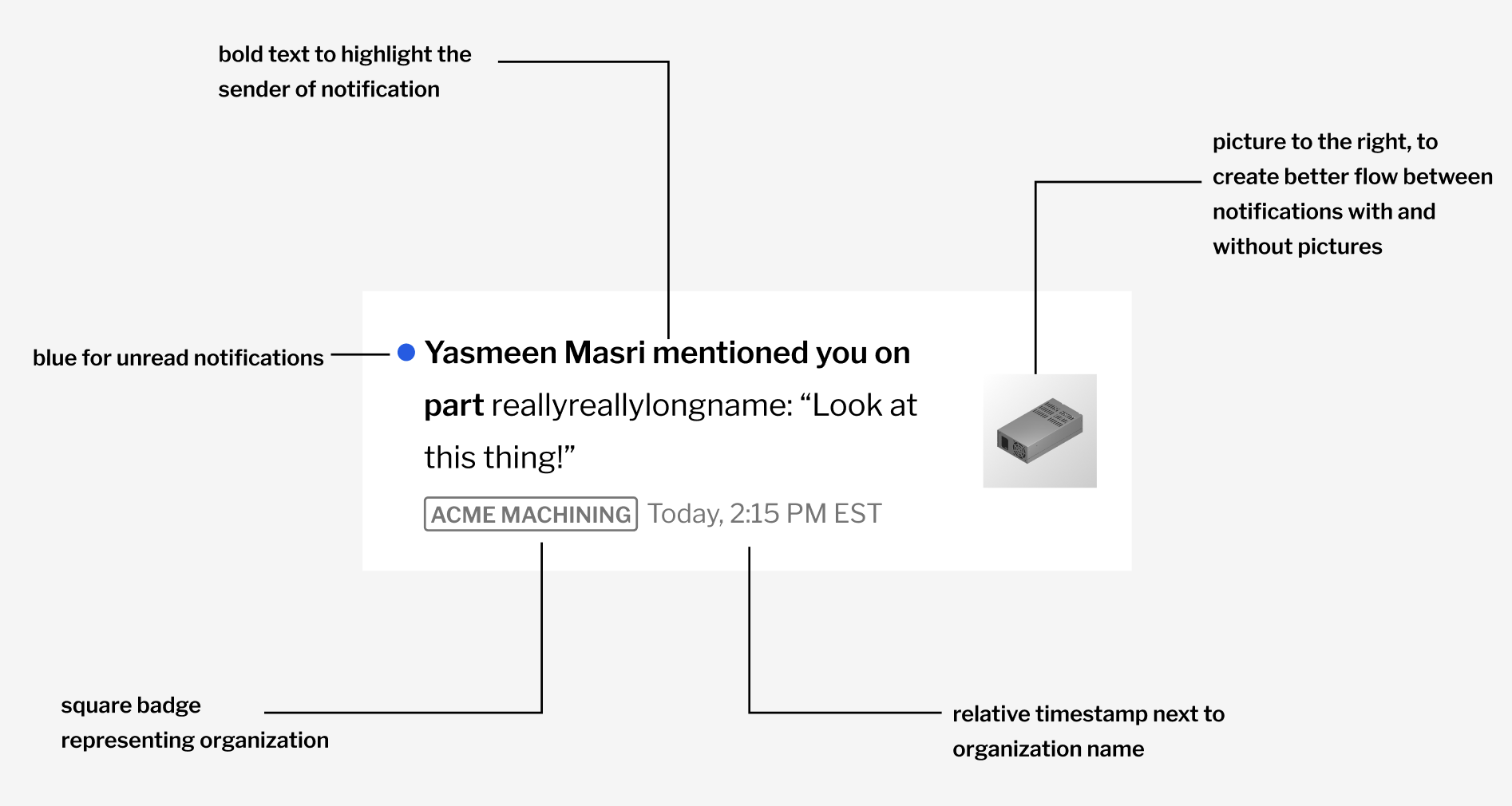
In this phase, I set out to determine the most compelling design direction for notification cards, which are the building blocks of the popover and page. I experimented with different aesthetics, placements, and brainstormed pros and cons for each idea with the design team.
Option 1
pill shaped badge for the organization (top)
relative timestamp
Option 3
square badge for the organization (bottom)
relative timestamp
Option 2
pill shaped badge for the organization (bottom)
relative timestamp
Option 4
string for the organization (bottom)
relative timestamp
After weeks of discussion and rounds of iteration, we landed on option 3 for the notification cards. The reason for that was including the organization next to the timestamp flowed better more visually and allowed for better information hierarchy.
Additionally, option 3 (square badge) was already part of our design system, as opposed to the pill shaped badge, which wasn’t a part of our design system. This increase in scope and engineering effort was avoided by landing on option 3.
Design & Deliver: Building the notification cards, popover, and page
I began with the building blocks… the notification cards. There were various notification types that had to be designing (default, hover, and active states), taking into consideration the anatomy of the new notification card (below).
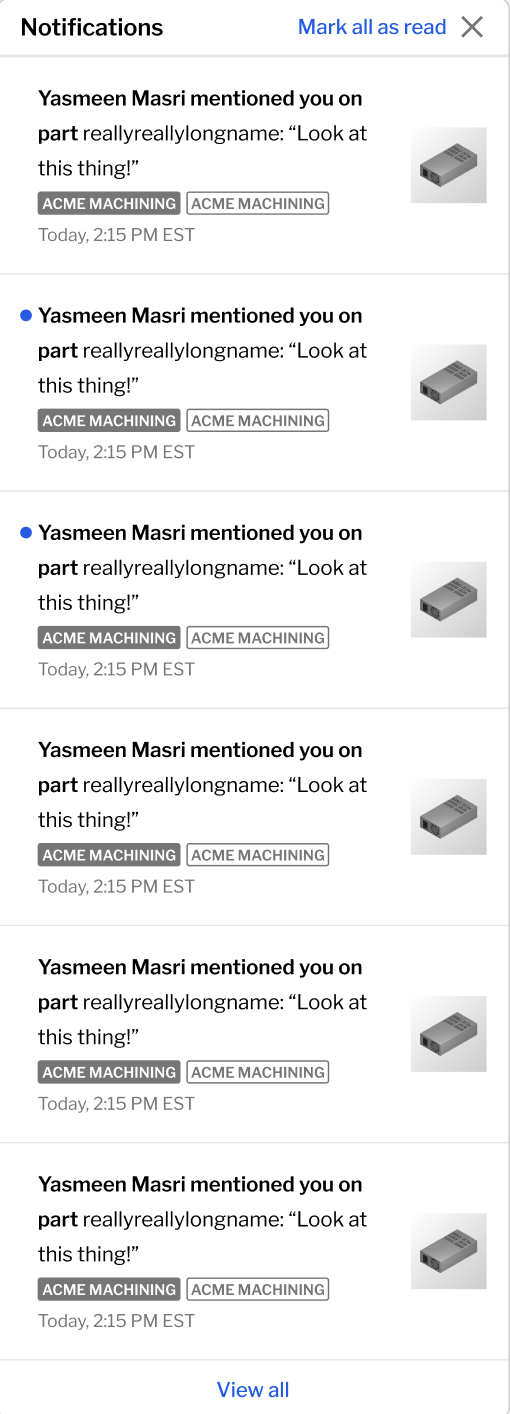
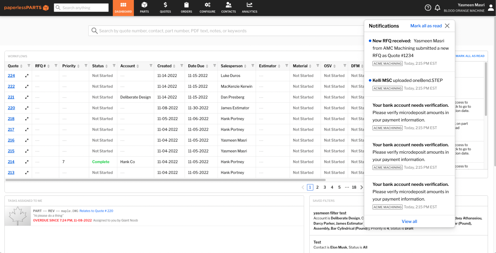
After building the notification cards, the notification popover, which appears when the bell icon is pressed, was next.
The popover features include: most recent 5 notifications, ‘Mark all as read’ button, ‘View all’ button that refers users to the homepage, and an ‘X’ button to close.
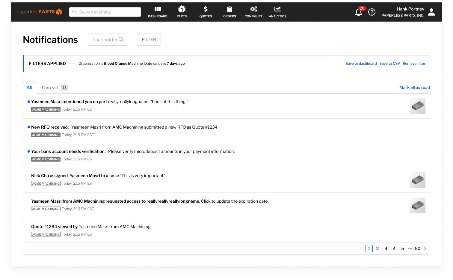
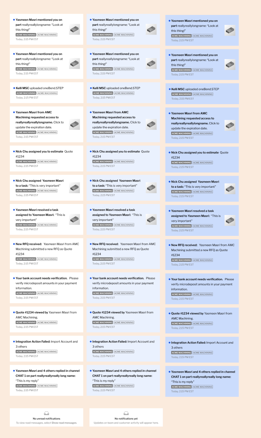
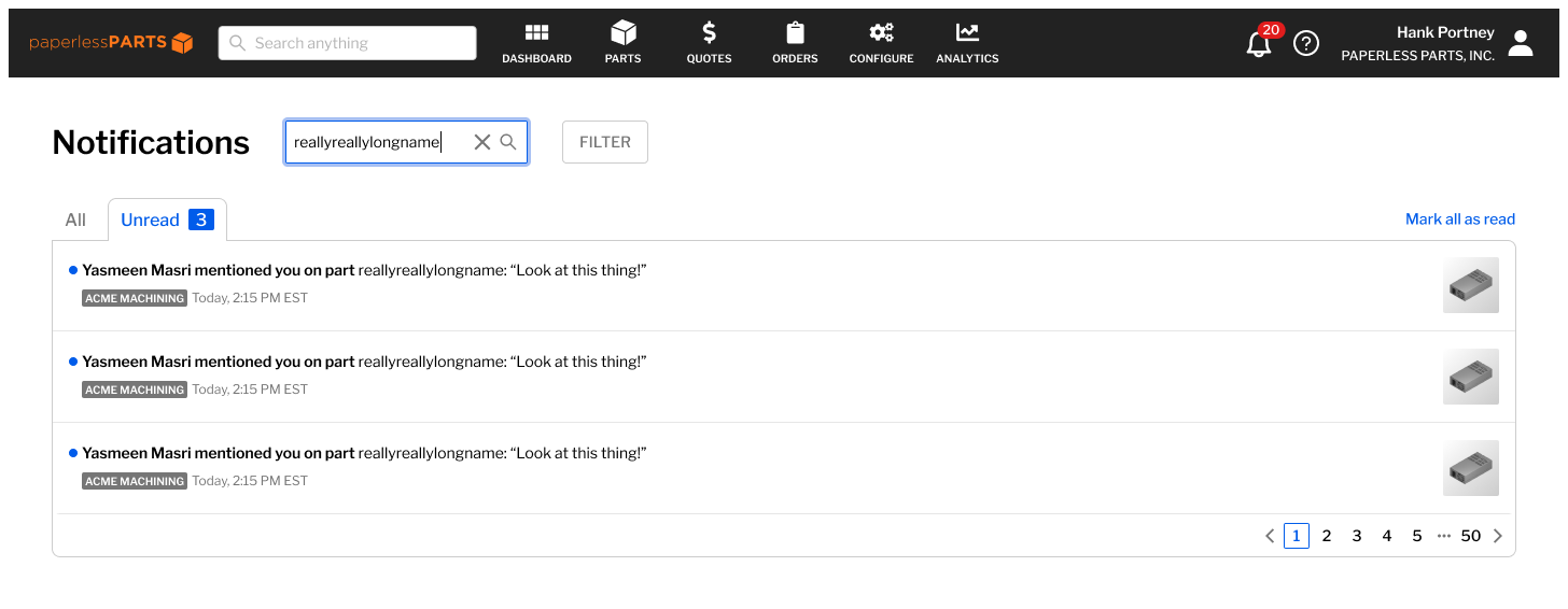
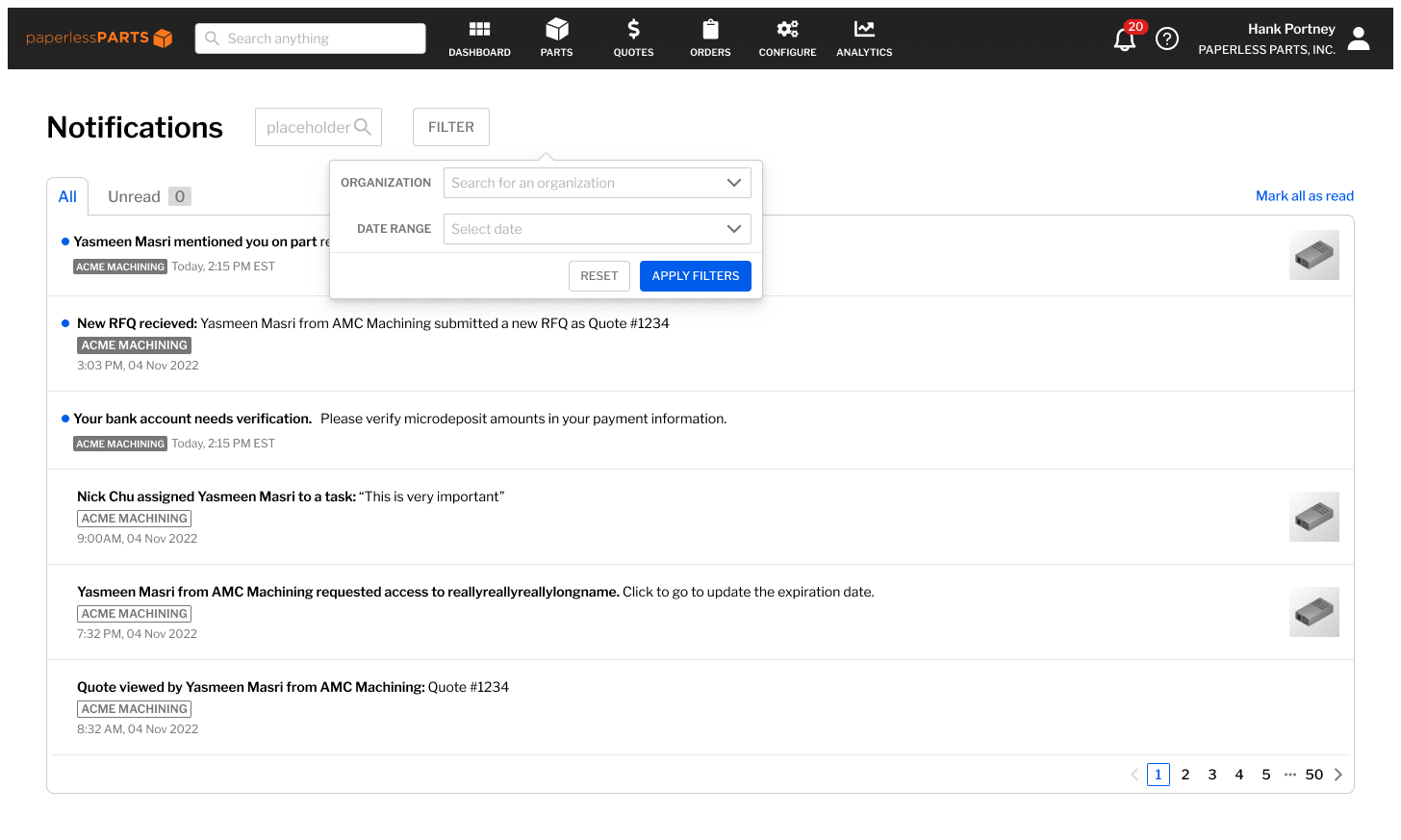
Lastly, I worked on designing the notification page, which included search, filter, empty states as well. Check it out below!
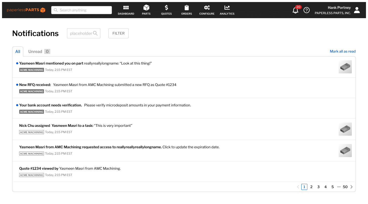
All notifications
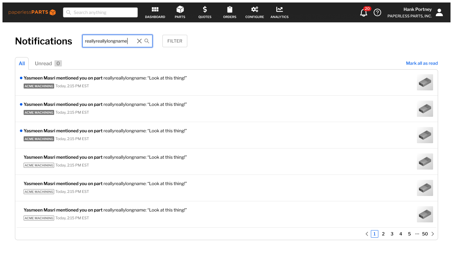
All notifications, search input
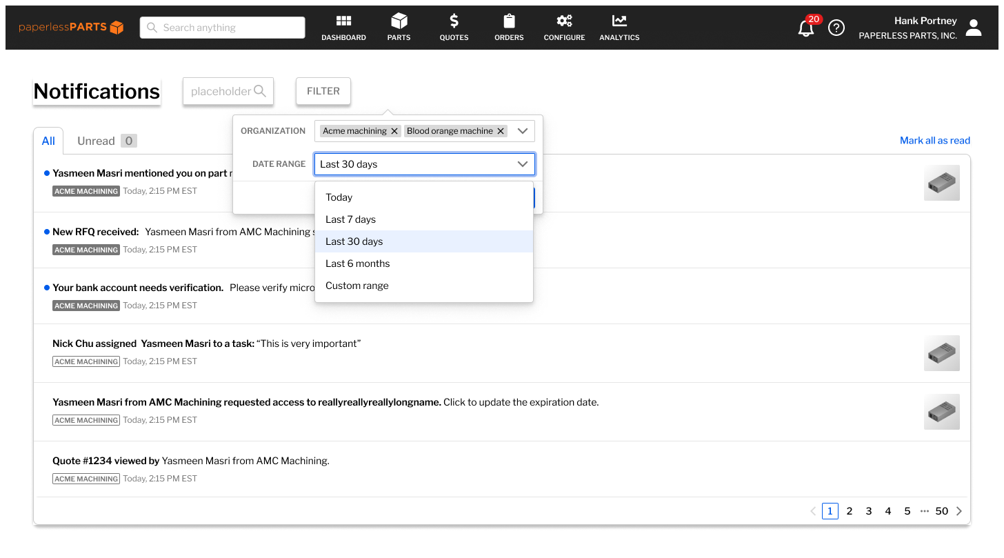
All notifications, filter input
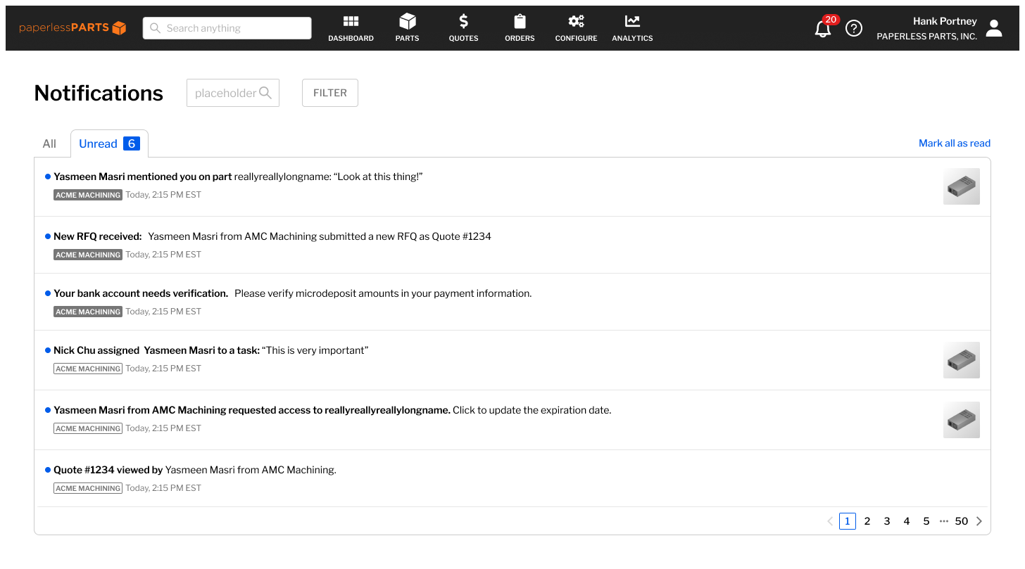
All unread notifications
Unread notifications, search input

Unread notifications, empty search results
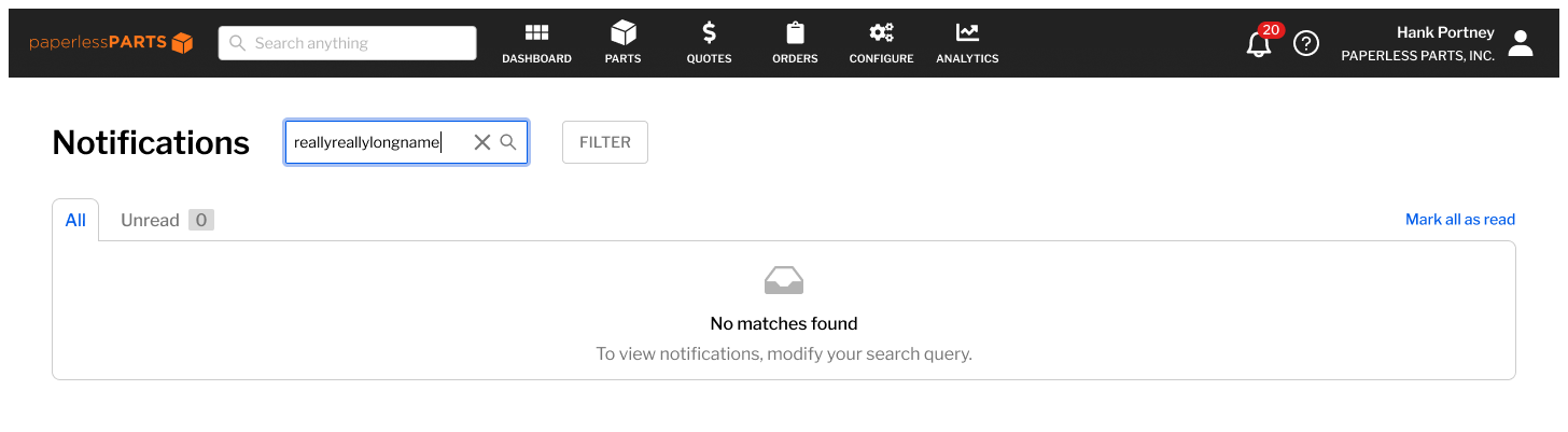
All notifications, empty search results
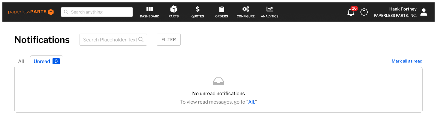
Unread notifications, empty state
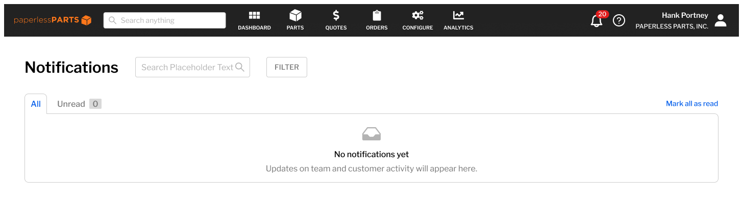
All notifications, empty state
All notifications, filter input