Designing a Data Usage Dashboard Experience for Home Internet Customers @ Verizon
🚨 How might we empower our home internet customers with the information they need to effectively monitor and manage their home internet data usage?
Team
Yasmeen Masri, Nathan Chapman, Jahanzaib Malik, and Eugene (Gene) Timmons
Research
Timeline
4 months, May - September 2024
Role
Product designer & project manager. This included: defining project plan, research study stimuli, managing communication with different stakeholders (digital, product, development, and research), conducting competitive research, user journeys (happy/unhappy paths), running a usability testing, and the end-to-end design.
Methods
MaxDiff study (in collaboration with CMI, our research organization), competitive research (direct and indirect), user flow, user statements, wireframing and high fidelity prototyping.
Deliverables
High-fidelity prototypes and launched data usage experience.
Process overview
🔎 Research: project planning, competitive research, and MaxDiff study.
📢 Define: minimum viable product (MVP) feature requirements and user flows (happy & unhappy paths).
🎨 Ideate: over 7 rounds of ideation, ideation workshop with design team.
💻 Design & deliver: high-fidelity design of end-to-end experience & handoff.
Background
In May 2024, I joined Verizon as a Product Designer on the Home Internet Network Management team. At that time, one of my very first projects was the end-to-end design of a data usage experience for Verizon Fixed Wireless Access (FWA) customers - 5G Home & 5G Home Plus.
Project planning: what are our goals, key metrics, and timelines?
To kick off the data usage experience design, I established clear goals to guide the project, including improving user awareness of their data consumption and empowering informed decision-making.
Our key metrics included increasing user engagement with the data usage dashboard, reducing customer support queries related to data limits or slow speeds. With these objectives in mind, we communicated various stakeholders to collaborate and define a suitable timeline.
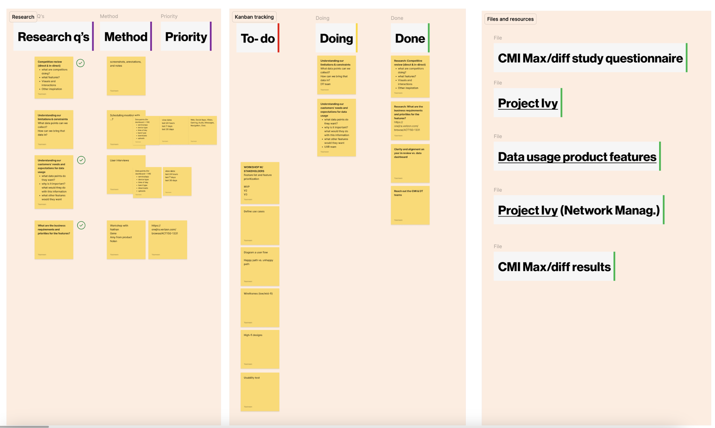
At the same time, I worked on defining our answered vs. open questions, methods of research, and priority. Lastly, I started Kanban board to track team tasks, milestones, & progress.
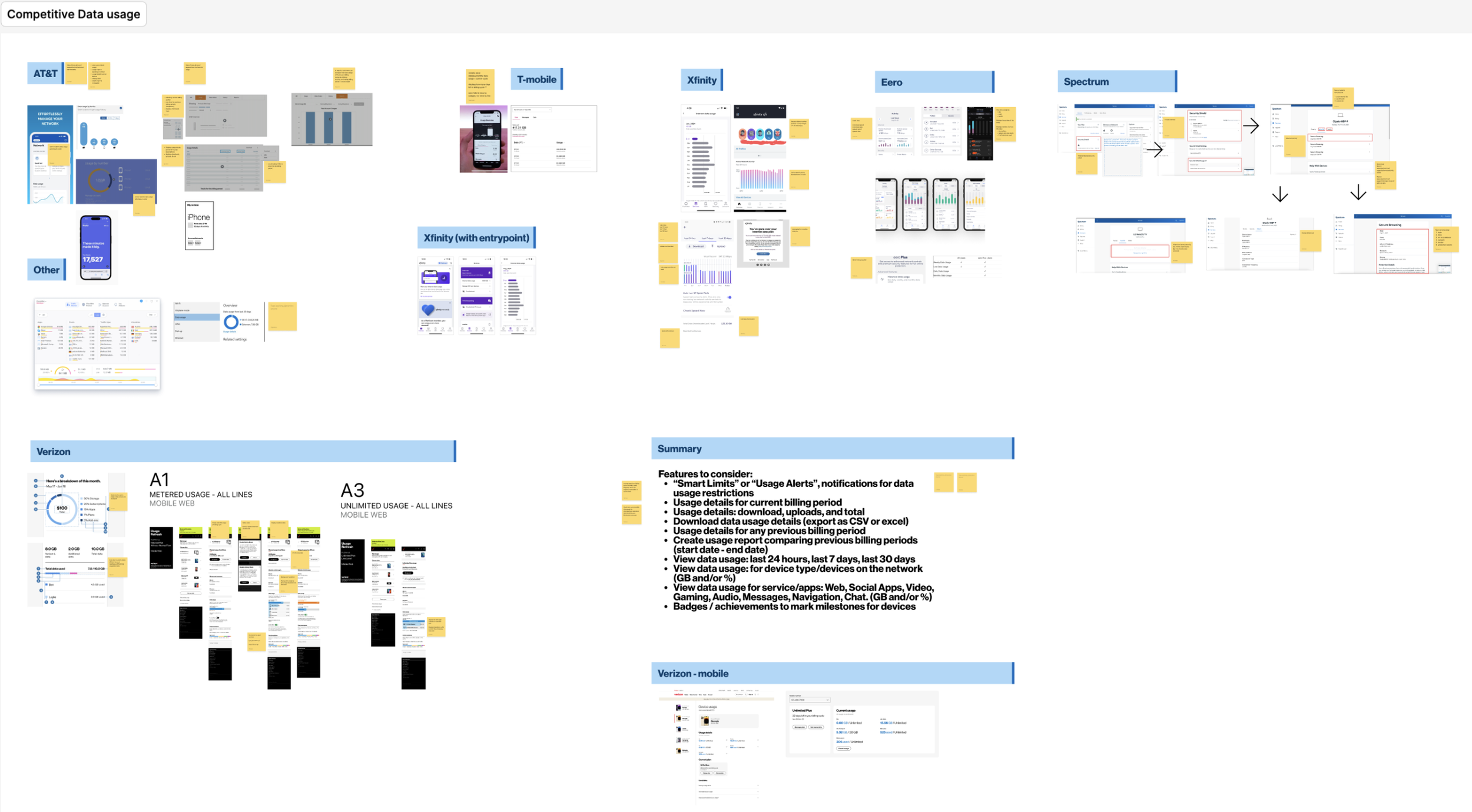
Competitive research: what are other ISP’s doing?
We conducted a detailed analysis of how 5 other ISP’s approach data monitoring and usage, identifying best practices, trends, and gaps in the market. This included: AT&T, T-Mobile, Xfinity, Eero, & Spectrum.
This research provided insights into expectations of common features, such as data usage alerts, data usage details for custom date range, device & app data breakdowns, and uncovered opportunities for differentiation, such as personalized insights and data usage projections.
MaxDiff study: what features do our customers prefer?
After conducting a comprehensive our competitive analysis, we were left with a list of many possible features and ideas. To help us prioritize which data usage features, at least for the MVP, we collaborated with Customer Marketing Insights (CMI), Verizon’s research department, to launch a MaxDiff study.
During this time, I led the communication and scheduling efforts with our CMI contact, simultaneously working with him to define our research goals, questions, and working with the team to define the test stimuli. This was tested with 306 Verizon home internet customers and prospects. The results of this study prioritized our design efforts and feature requirements.
Define
MVP feature requirements: what’s now & what’s next?
The MaxDiff study helped us prioritize features based on customer desirability and appealness. Now, it was time to gauge the developers on the technical feasibility of the features.
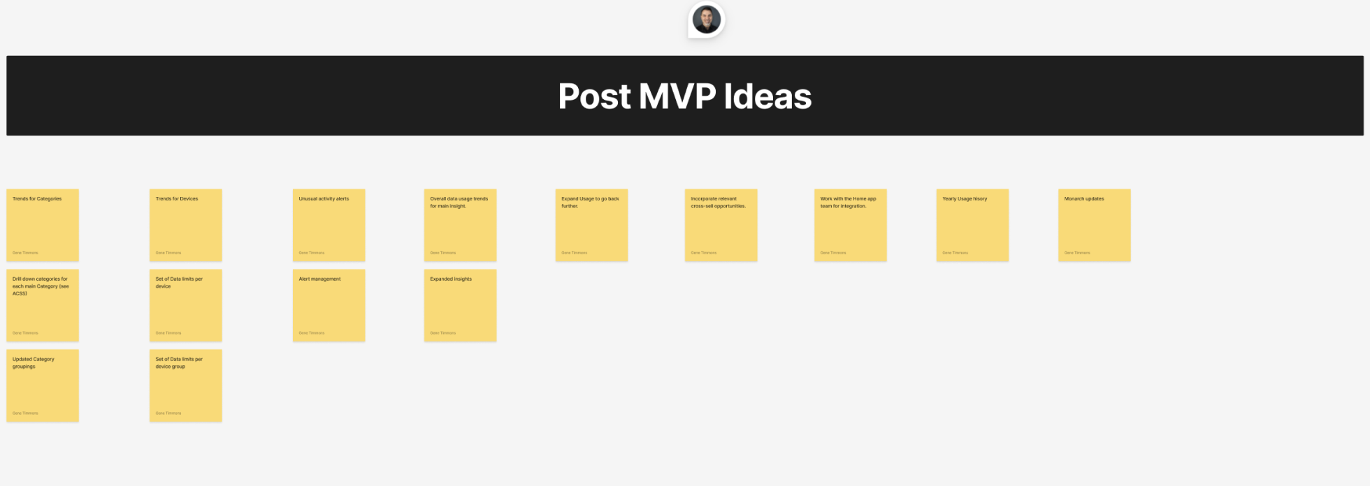
I collaborated closely with our engineering & product/digital partners to assess the feasibility of each requirement, within the given timeline. After many conversations, we came to the realization that some features would not be possible for the MVP, so we recorded them for a future enhancement.
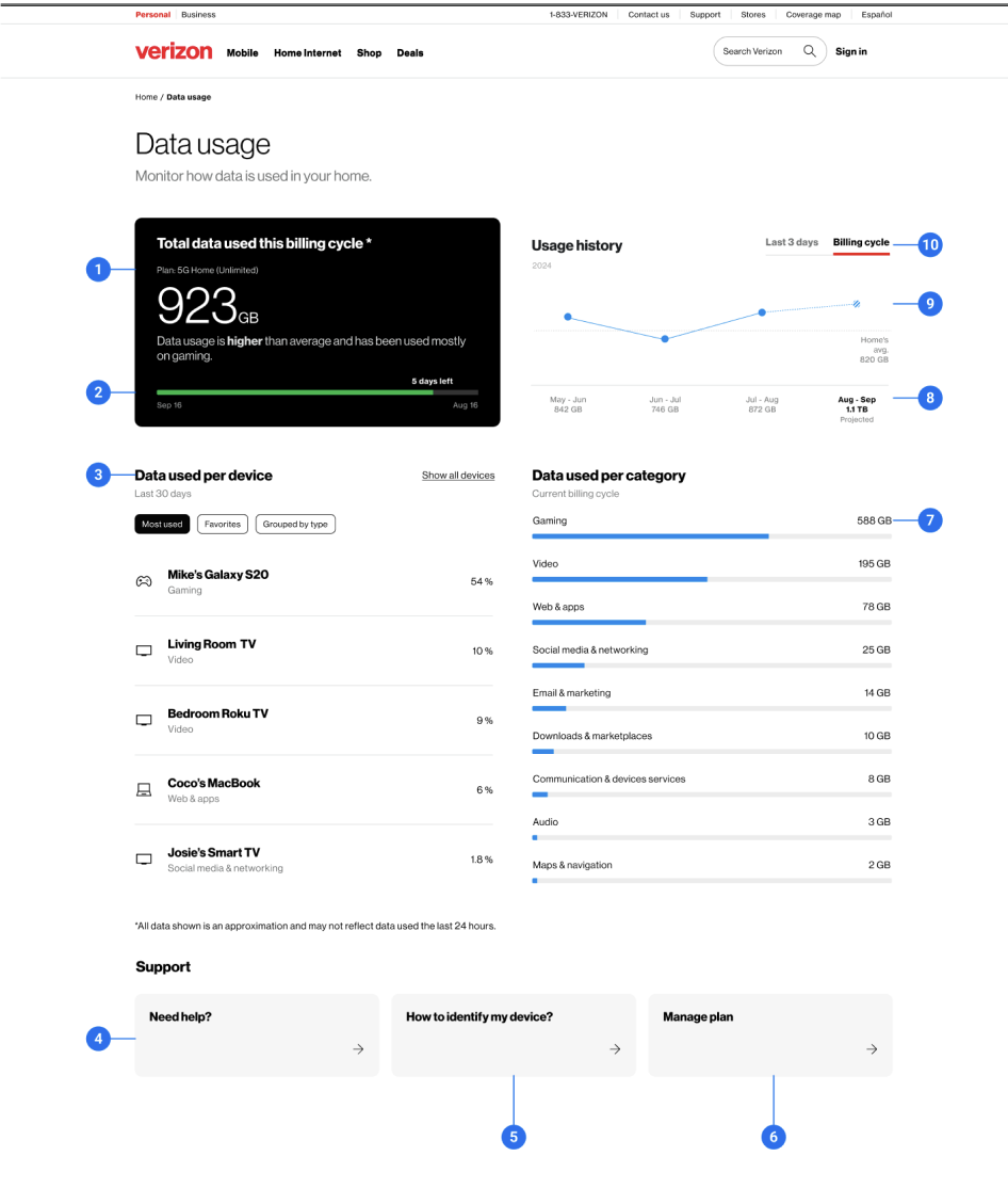
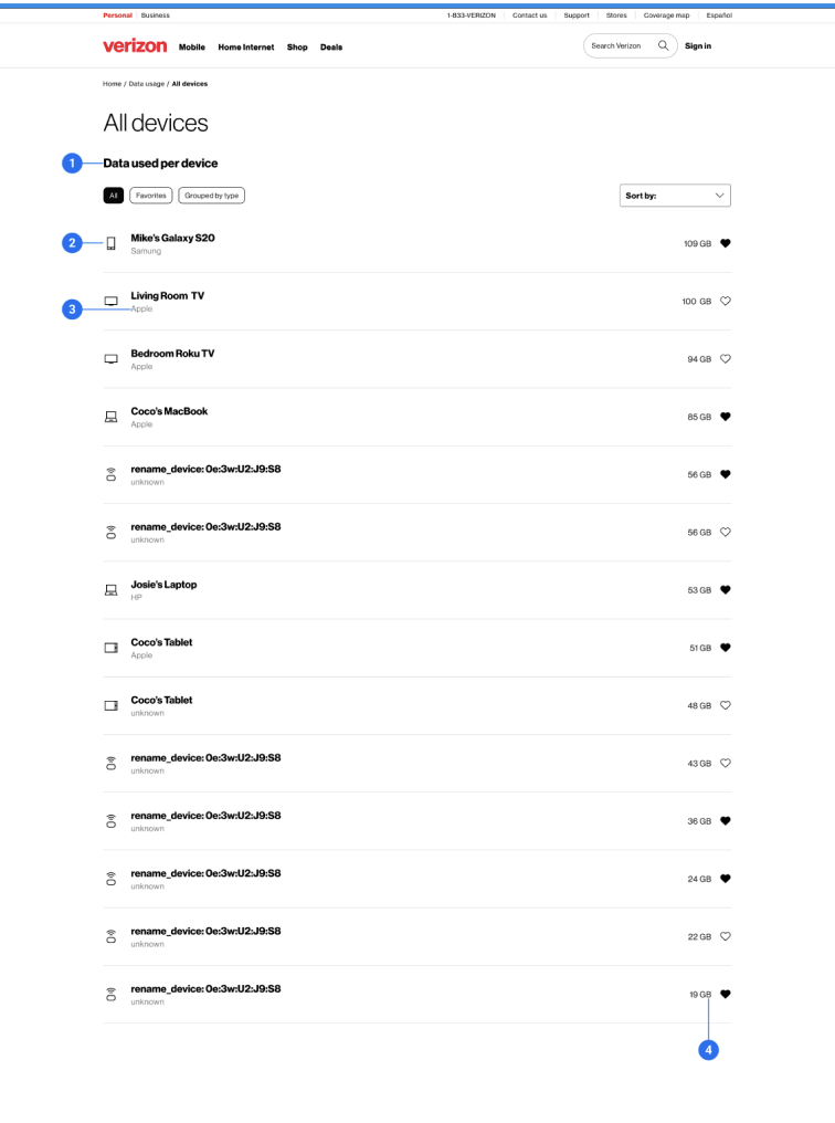
The result was a clear and actionable prioritized list of features for the MVP Data Usage Dashboard.
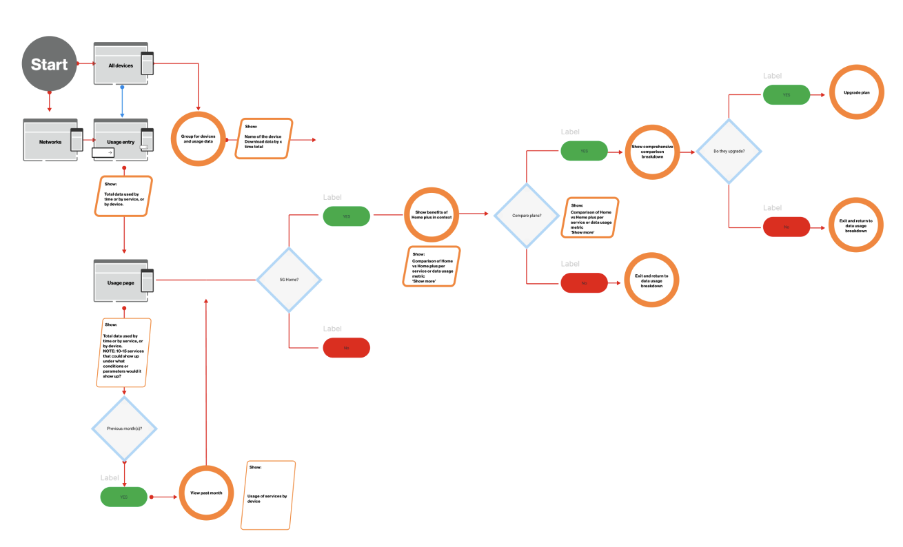
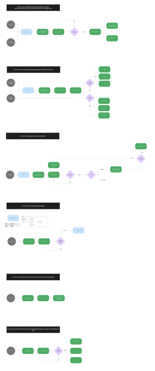
User flows: what are our happy & unhappy paths?
We create detailed user flows for multiple use cases, focusing on designing for both the happy paths and unhappy paths. By designing for these scenarios, we made sure that our next step, ideation, would include a solution that addresses user needs holistically, reduces friction, and anticipates challenges users may face.
Ideate
Ideation workshop
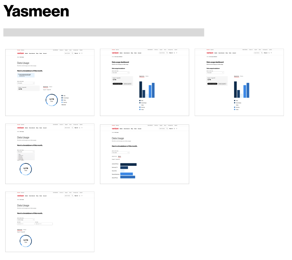
With over 7 ideation rounds, we’ve explored multiple data visualization concepts through rapid ideation and iteration, using an internal workshop to test directions and converge on a final design approach.
Design & deliver
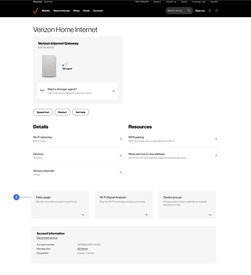
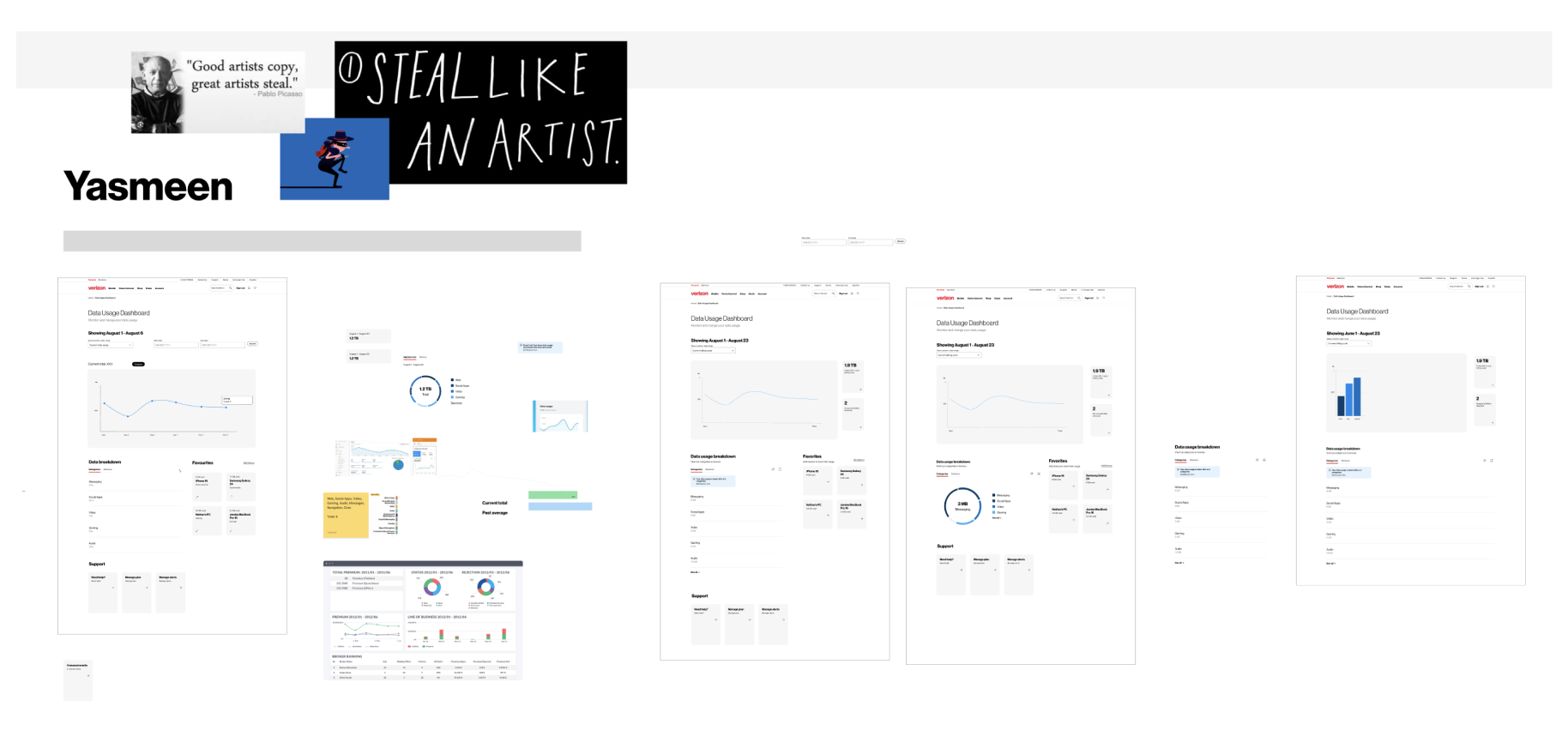
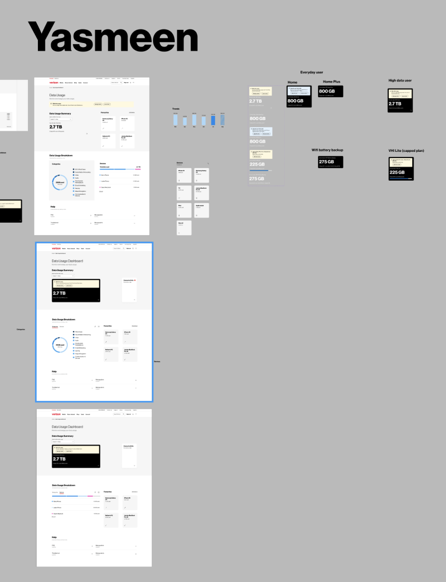
High-fidelity design
Following the ideation workshop, we converged on a final design direction, enabling progression into high-fidelity designs across all use cases. Designs were thoroughly annotated to support clear handoff and close collaboration with engineering.